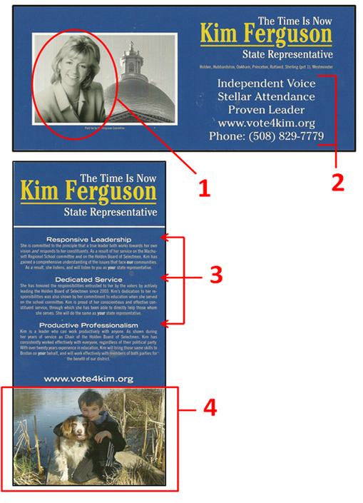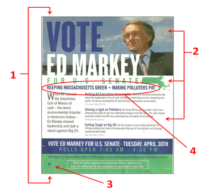
Balancing the right amount of substance with a design that is pleasing to the eye is tough to do. Too little substance can make a candidate seem unqualified, while too much information jeopardizes how much the reader will retain. This flyer for Massachusetts State Representative, Kim Ferguson is a good example of how to handle that delicate balance.
The front of this card has a very simple design that includes all the basic information you want to resonate with the voter. The font size is large enough to make the information easy to read in a matter of seconds, while the ample border space makes the visual experience inviting to the reader.
Being a full-color flyer, it is interesting that Ferguson decided to use a black-and-white picture of herself instead of a color one (1). Unconventional as this may be, the lack of color in the picture forces the reader's eye to gravitate to the only splash of color on the front of the flyer - her name. So this may have been done intentionally for this very purpose.
Another critique of this flyer is that the 3 campaign points blends into the contact information (2), making it look like one block of text with 5 lines. Creating more space between the two sections and/or inserting a divider line would give both sections just enough separate distinction.
Looking at the back of the flyer, you will find a very clean layout that complements the front of the flyer quite nicely. There are three distinct sections: Logo, body, and photo - it does not get much simpler than that!
The body itself is broken into 3 sections, all with distinct headings (3). This is where the balancing act is navigated perfectly. Most people will read the headings while bypassing the actual body. Having the right amount of text will validate the heading for those people who choose not to read the body, while providing just enough substance for those readers who want to dig a little deeper.
How many times have you heard the cliché of politicians kissing babies? The reason why this is so prominent is because early on politicians figured out that kids sell, and when you throw puppies on top of it, you have a winning duo that no voter can deny.
In another unconventional move, Ferguson did not include herself in the picture on the back, but instead used a great photo of her son holding his puppy on the waterfront (4). No matter how you look at it, the best political pictures always include puppies, kids, or both - so always make sure to include pictures like these when determining a flyer's layout.
The Good
1. Simple layout
2. Meaningful paragraph titles
3. Kids & Puppies!
The Bad
1. B&W Candidate Photo
2. Bullet points and contact information blends together
3. N/A
Overall Rating: A

 RSS Feed